Abstraction mindmap
tAsk 1: white paper test
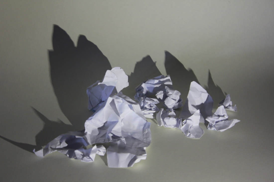
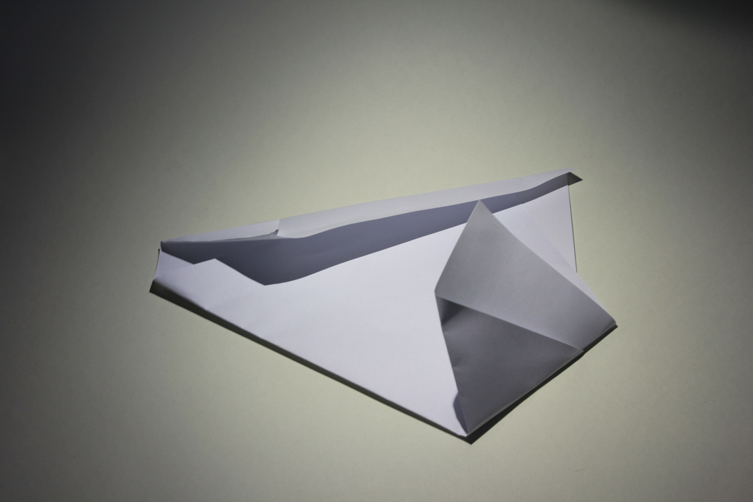
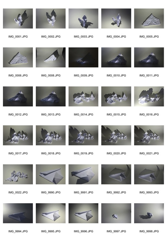
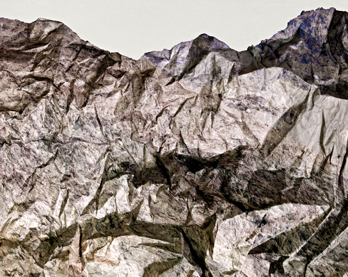
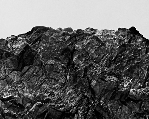
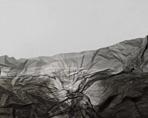
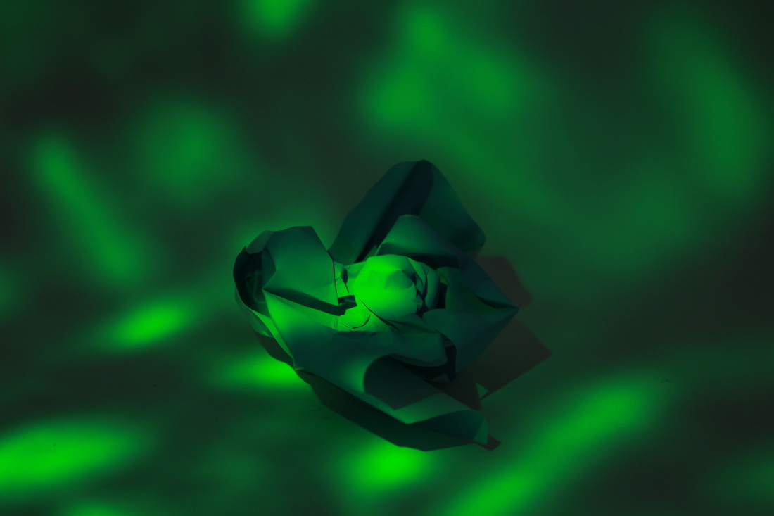
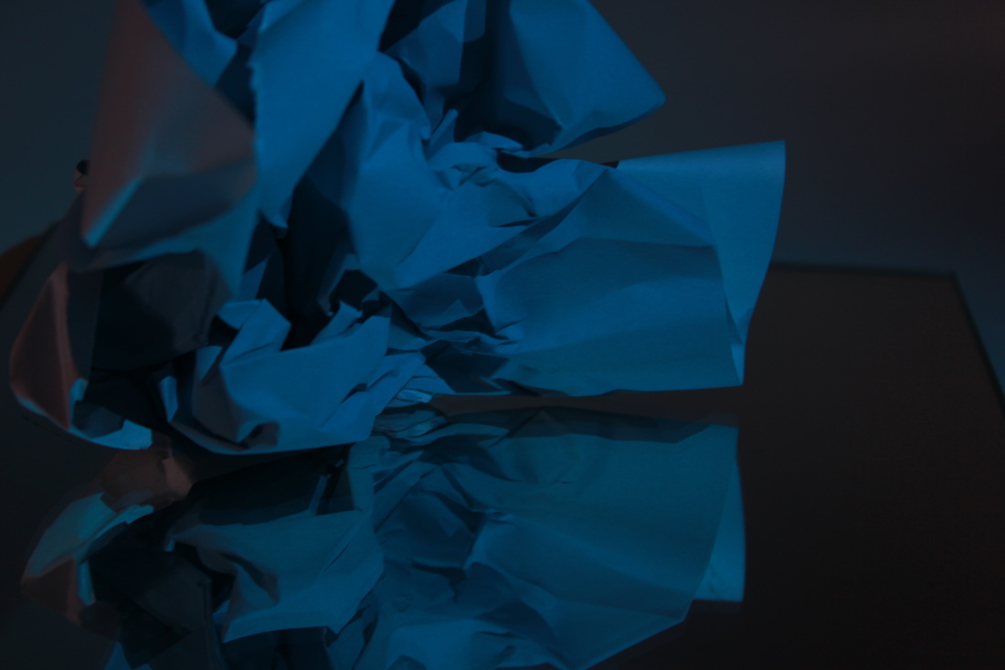
For this task I was instructed to use only a torch and a white piece of paper to create mountain like landscape. This fits with the theme of abstraction as it not only shows abstract shapes but use perspective to create illusions. I think that my three chosen images are successful because they range in technique first image went well as instead of shining a torch to create shadow I backlight the paper this created a glow in the middle of the image that creates a key focal point on the structure and adds a warmer light to the whole image. With the second image I actually used the torch in front of the paper to create shadow's behind the image I like this technique as it added depth to the image. The third technique juxtaposes with the other two as it is a flatter and less depth image, although I do admire the simplicity of this image. I think to improve I could have ranged in proximity to really play up the mountain landscape.

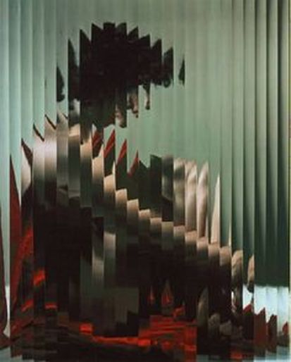
aRTISTS aNALYSIS: BRENDAN AUSTIN
|
|
|
Photographer Brendan Austin works as an architectural and landscape photographer this is shown throughout his images as they explore natural scenery and buildings. These images belong to a series called 'Paper Mountains.' Created in 2009 the images blur the lines between reality and fiction. Austin uses an interesting technique of using crumbled up paper to create realistic mountain landscapes. The photos have an uneasy edge to them as they are desolate and dark in colour, this fits in with Austin's intentions to make the reader see the impact humans have on the environment I attempt to build a story of an alternate nature. One in which is either devoid of people and the built environment or one which has taken a fictional event to have them vacate. This series is very interesting as the images are very incredible in the way that they're almost an illusion to the viewers eye.
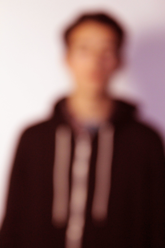
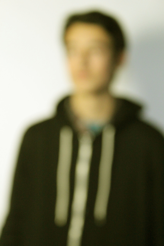
TASK 2: ABSTRACTION response
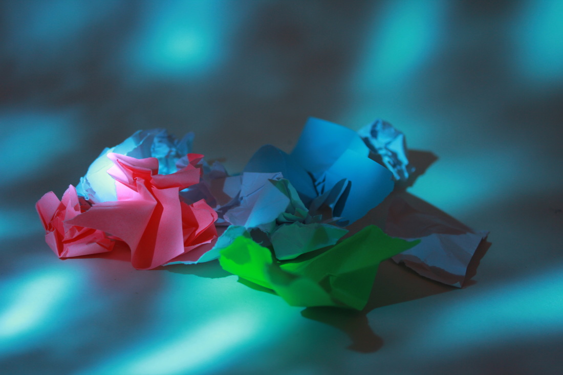
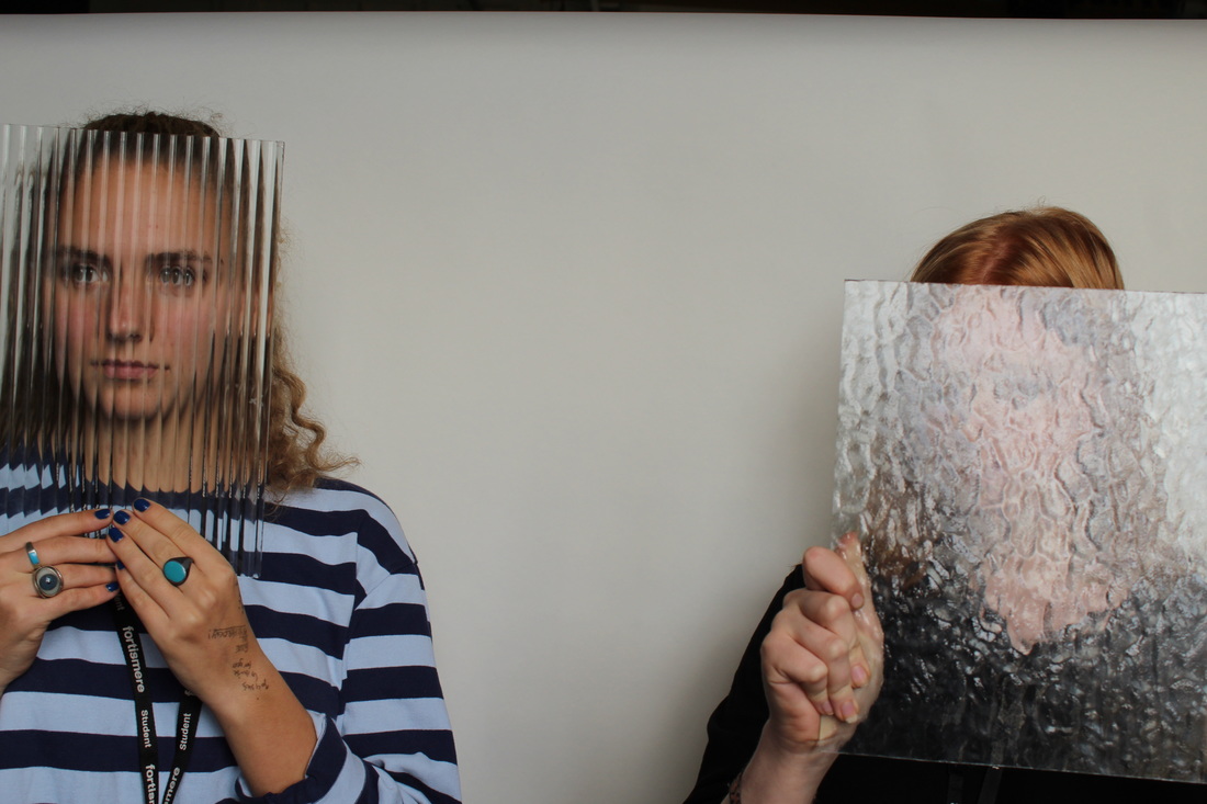
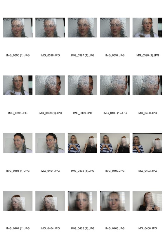
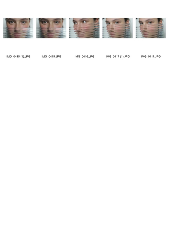
For my first response I decided to play around with coloured lighting. To do this I used coloured paper, a torch and coloured lighting. To further my response I also used patterned glass to add texture to my images and in one of my final images I added more to it by using a mirror to add an endless effect to add depth to the image. I like the way the images turned out as they have a good vibrancy to them which makes them stand out. To improve I think I could experiment more with the mirrors and the structure of the paper.
Abstraction Homework
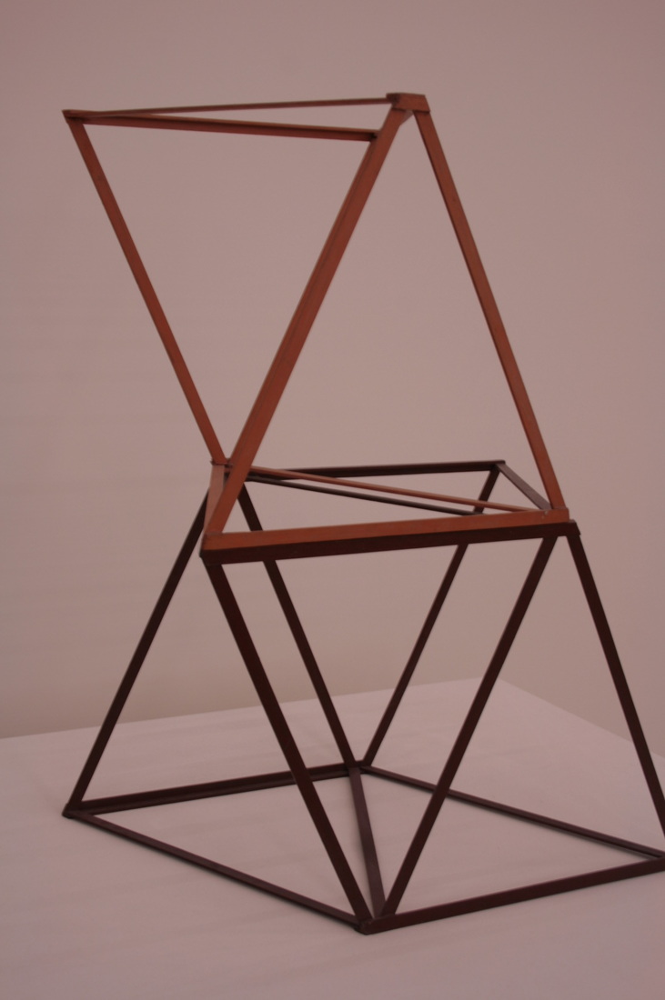
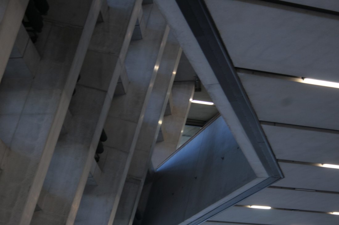
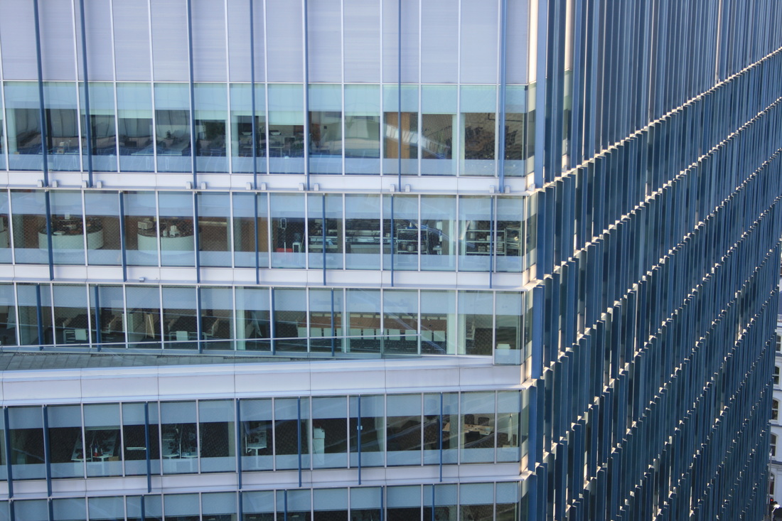
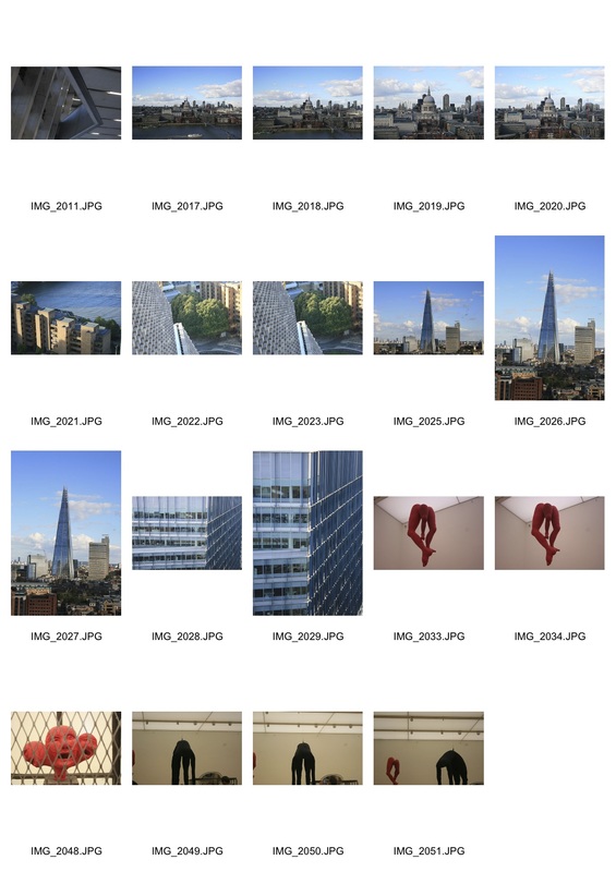
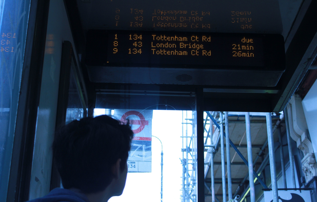
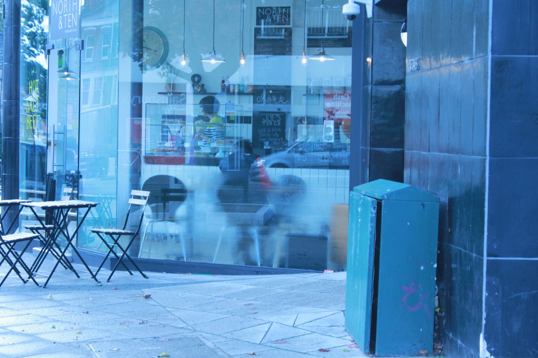
For this task I was instructed to take images of what I felt was abstract. I deiced to go to The Tate to take my images as they often feature lots of abstract art and the building its self has a rather abstract structure to it. I also decided to document the new 360 degree viewing platform as it shows a range of abstract buildings. To improve I would possibly change my subject and experiment abstraction possibly outside of a gallery.
|
|
|
|
Chemigrams
Artists Analysis
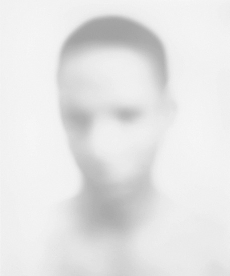
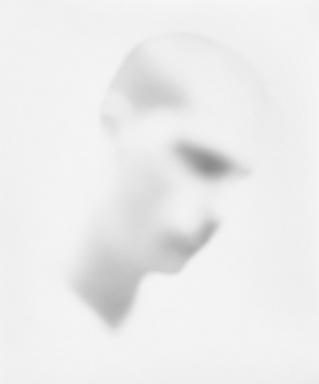
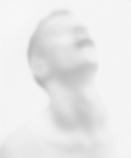
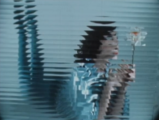
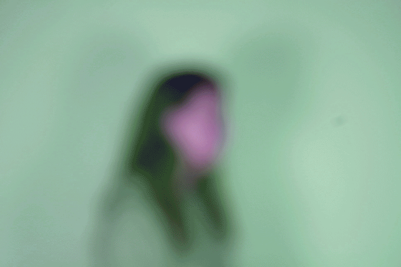
Bill JACOBSON
|
|
|
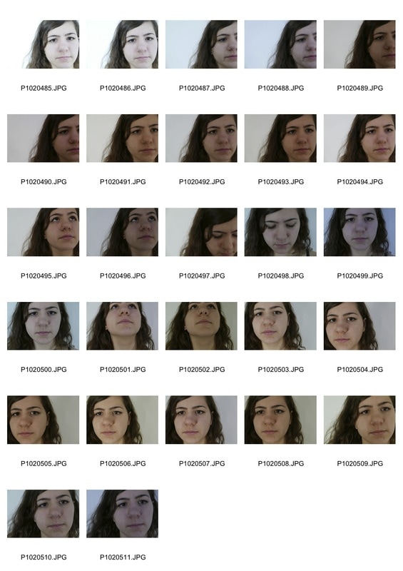
Bill Jacobson portrays ideas of loss and mortality in the early 1990's. This is shown by the capture of human likeness in memory portraiture. Jacobson was interested in this issue because of the AIDS epidemic at the time. In this series of images the faces are hard to decipher as they disappear into the background this gives an immortal effect to the photo. The images are inspired by early twentieth-century photography.
My response
|
|

|
|
Artist analysis
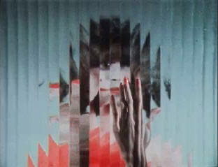
Erwin BLUMFELD
|
|
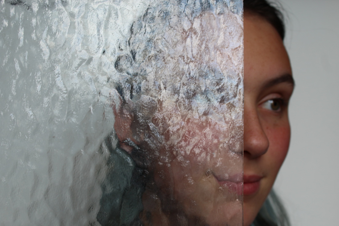
Blumenfeld is a well known German fashion photographer whose work has been published in Vougue and Harpers Bazaar. These images created by Erwin Blumenfeld were part of an original fashion film called 'Abstraction and Distortion.' This series is interesting because of the abstraction shown through the glass even though the images are distorted you can clearly make out the subject of the images.
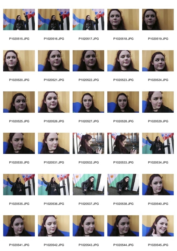
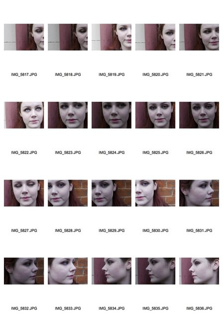
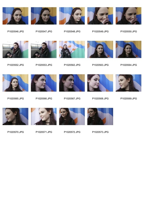
My response
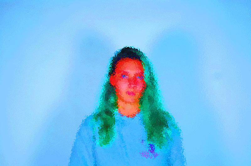
Colour editing
|
|
|
|
|
Saul leiter
|
|
Three strands
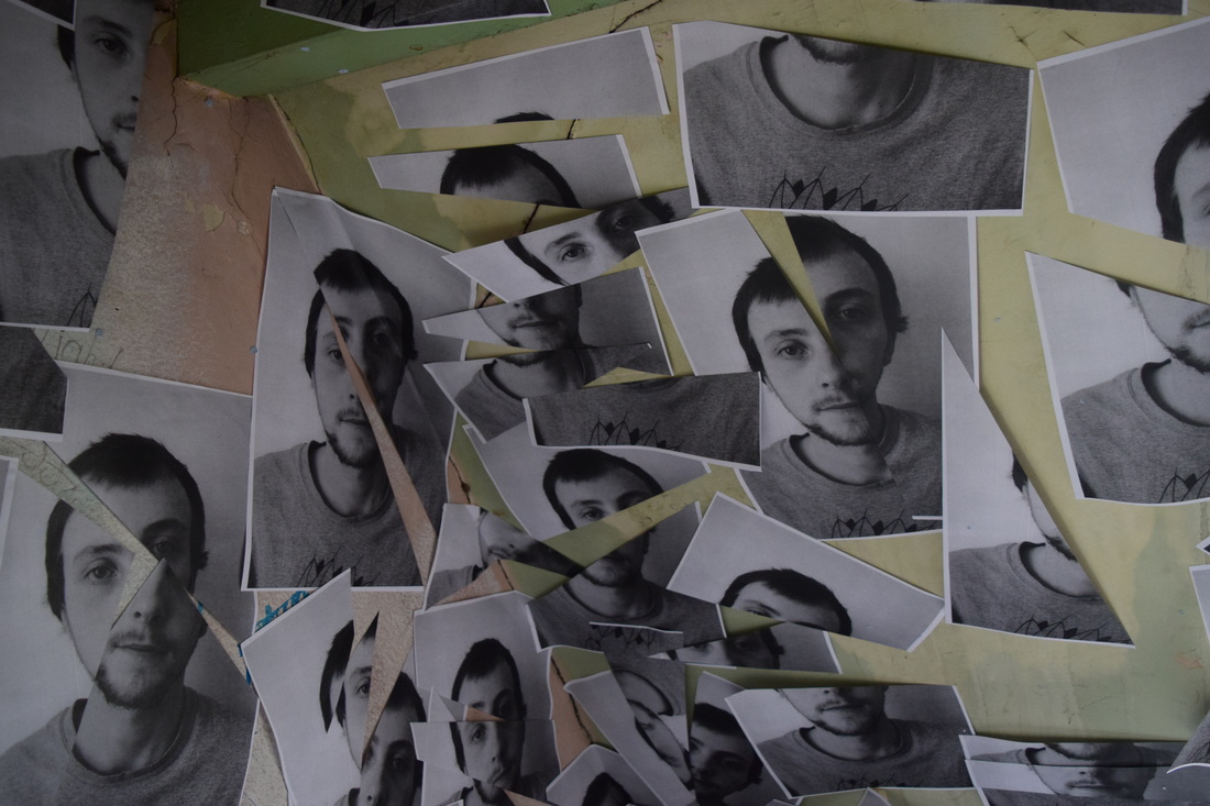
ARTIST INSPIRATION
Abstraction in portrature
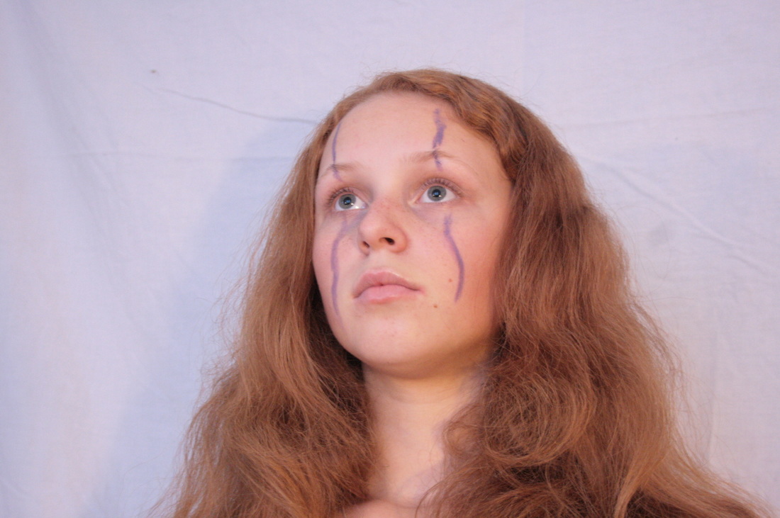
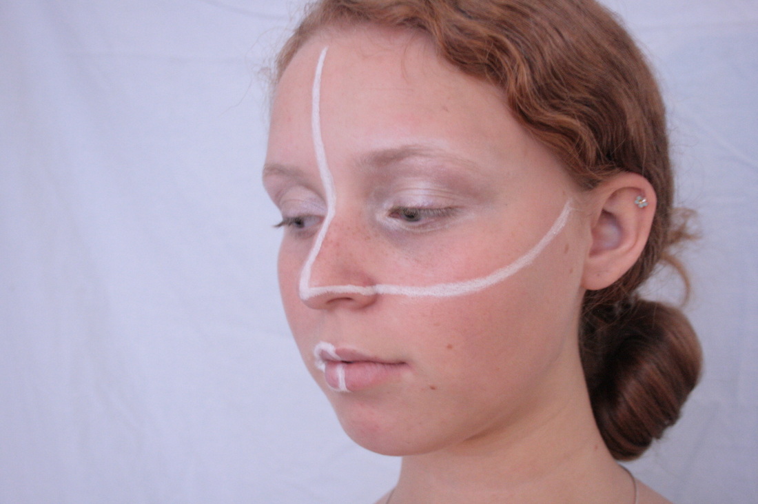
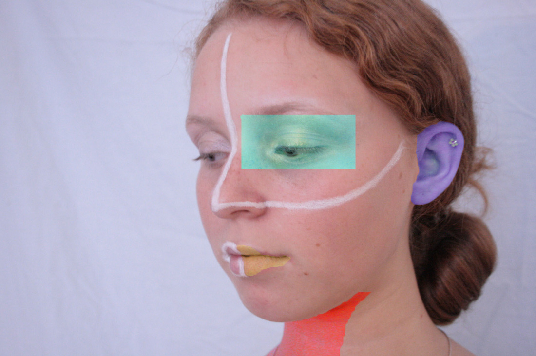
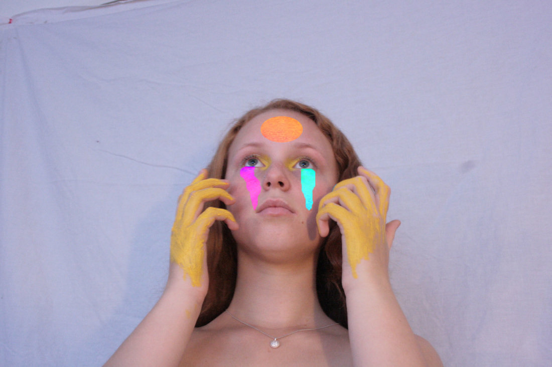
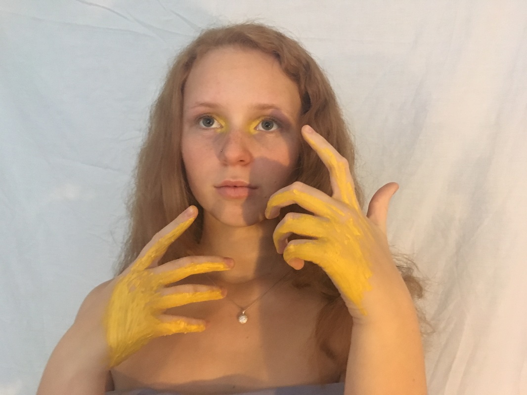
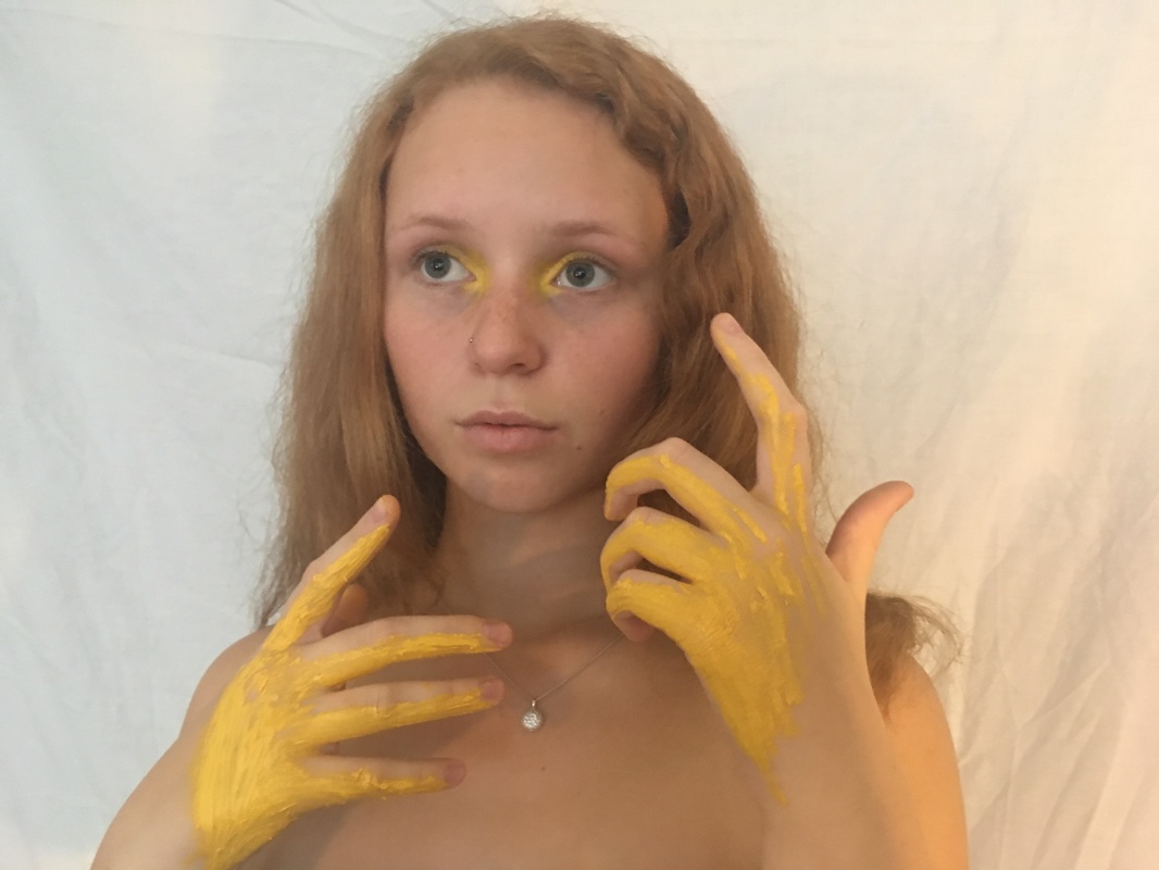
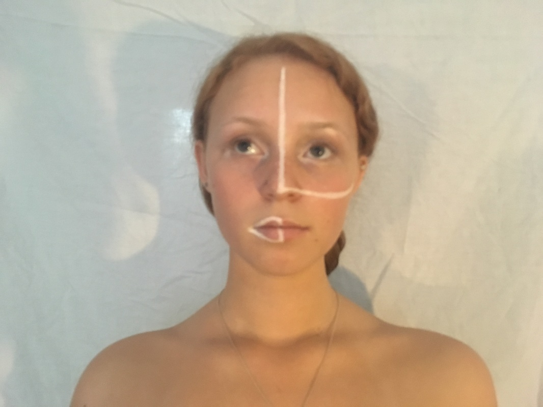
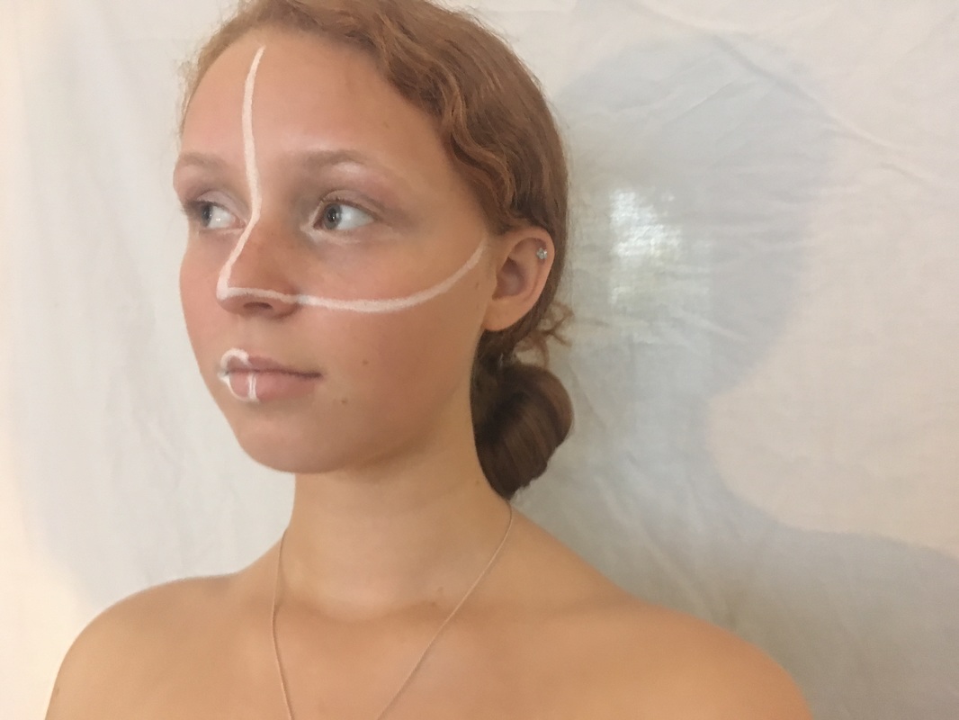
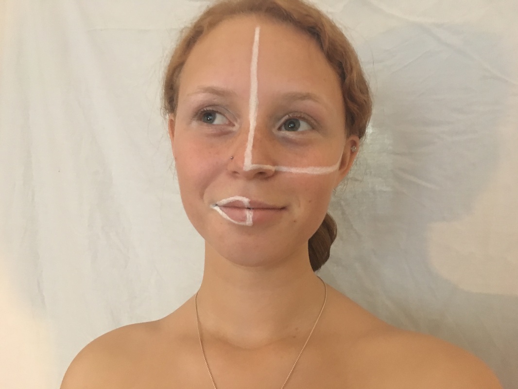
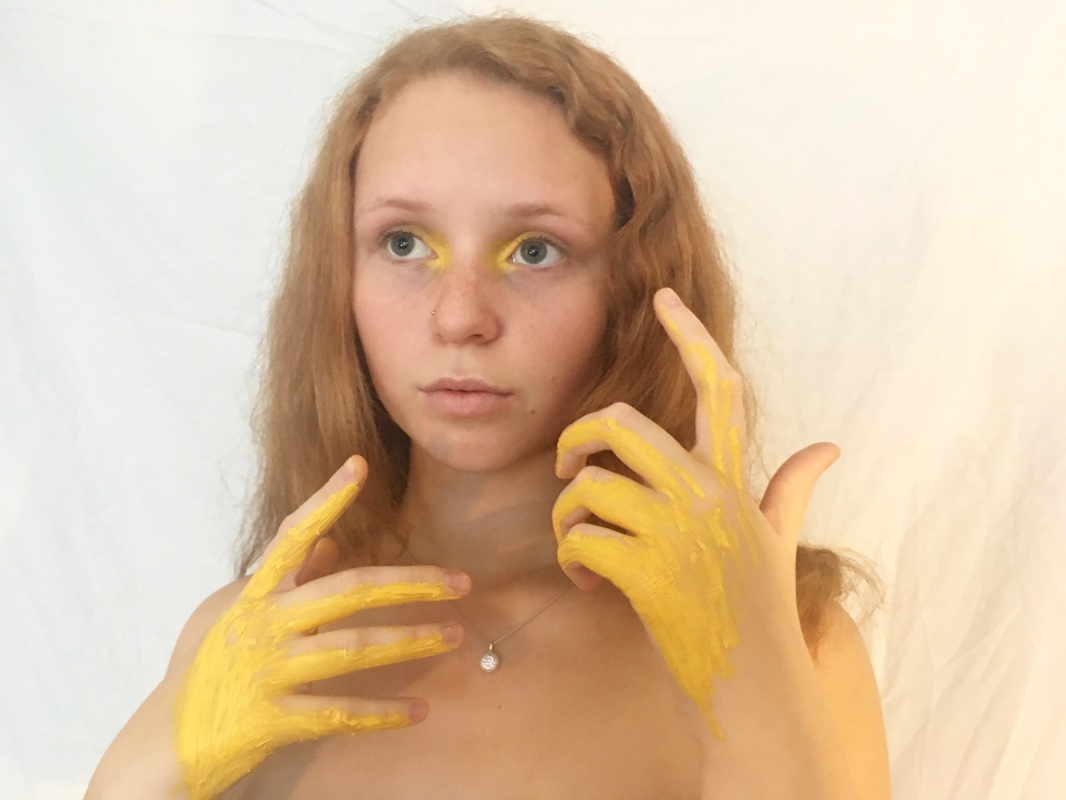
For my first development I decided to take portraiture images but make them more abstract by drawing on the subjects face. I like this idea as I believe I can develop my ideas a lot further by actually changing the image perhaps by dividing and taking aspects away. I like how I have further edited these images in photoshop as adds more abstraction to the images. I think to improve I could definitely make the images a lot more abstract by messing around with the face a lot more.
|
|
|
|
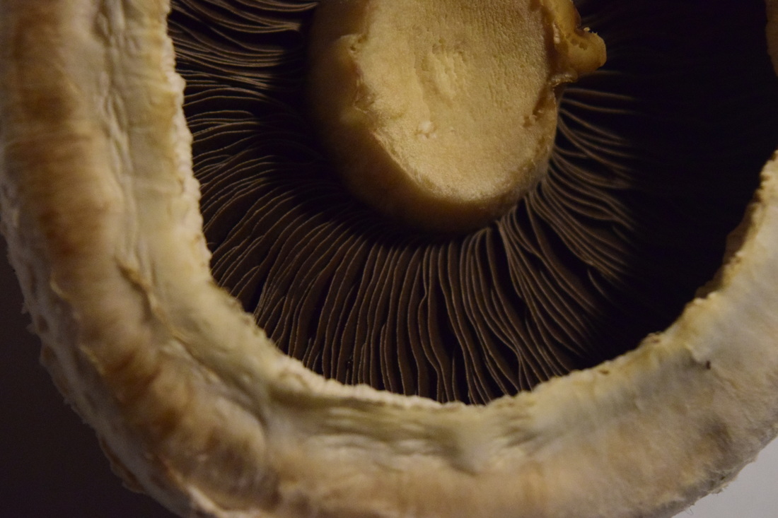
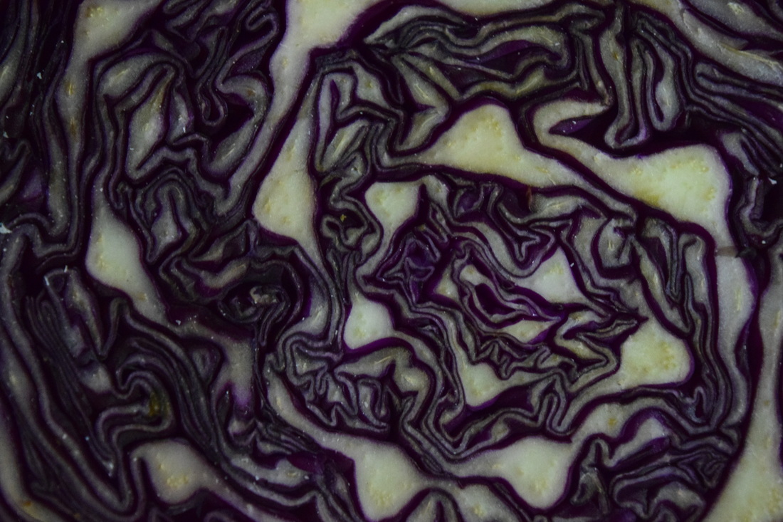
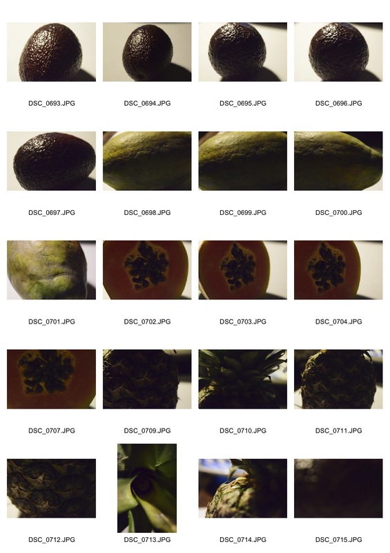
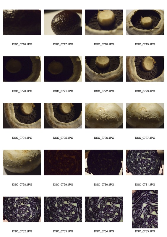
Abstraction in food
|
|
|
|
Desertion
|
|
|
|
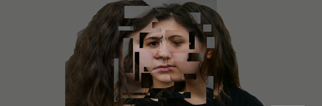
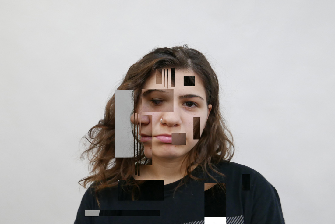
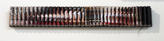
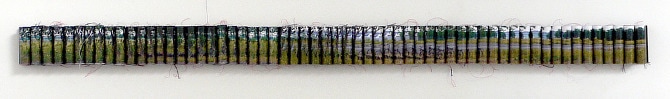
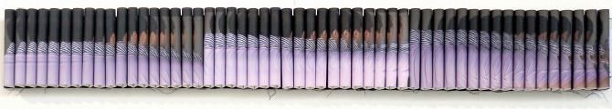
My chosen strand
For my final piece I have decided to develope my abstraction in portrature strand. I chose this strand because Im fascianted by merging the images together to create photos which on closure analysis have been mis-matched. With these particular photos I think some of the cuts work as they belnd togetehr well but I think
Strand development one
Strand development 2
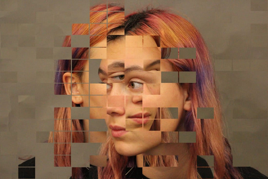
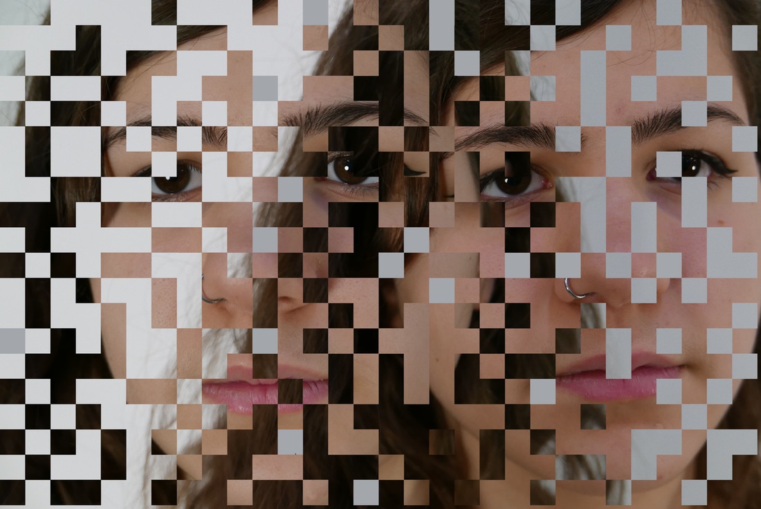
For this development I used regulated squares to create an ordered image. I prefer this technique as it is less freehand and merges the two images. By being more controlled I have allowed myself to create a more abstract piece.
Final piece
|
|
Artists Analysis
Lucas Simoes
For my final piece I will be use Siõmes work to create my own Quasi-cinema. I like Siõmes work as it is the perfect mixture of organised and mayhem. This work fits with the theme of Abstraction as it
